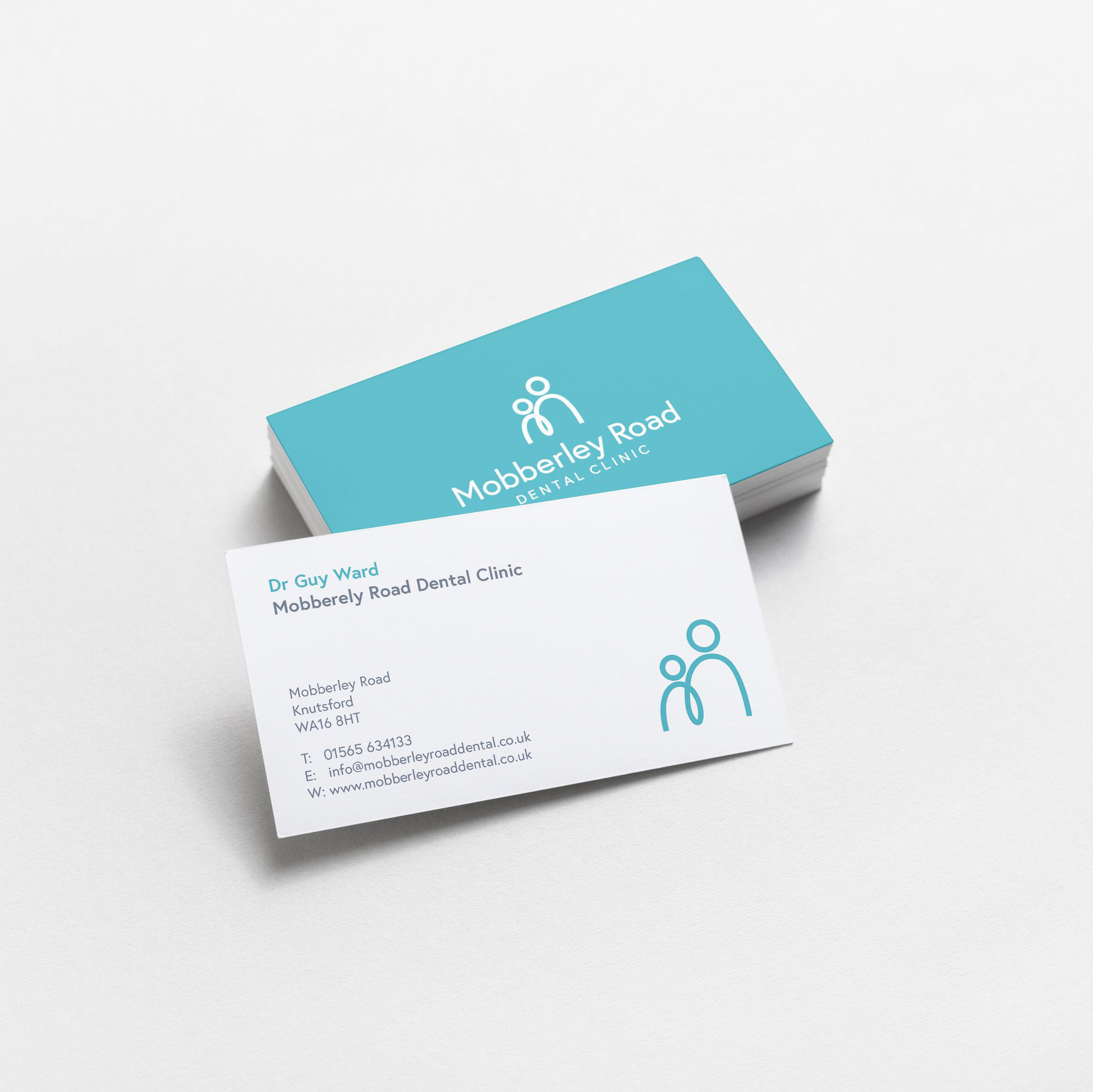
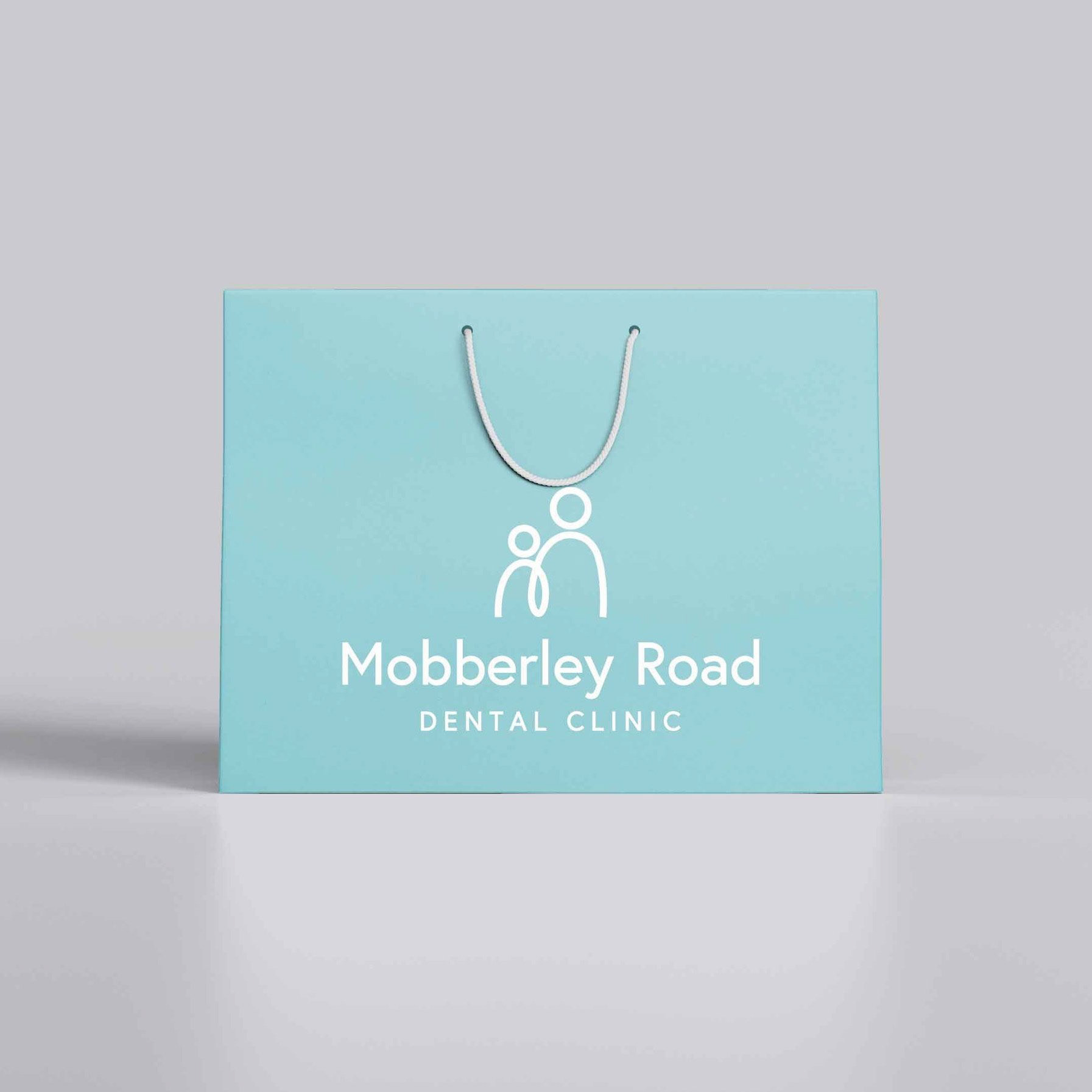
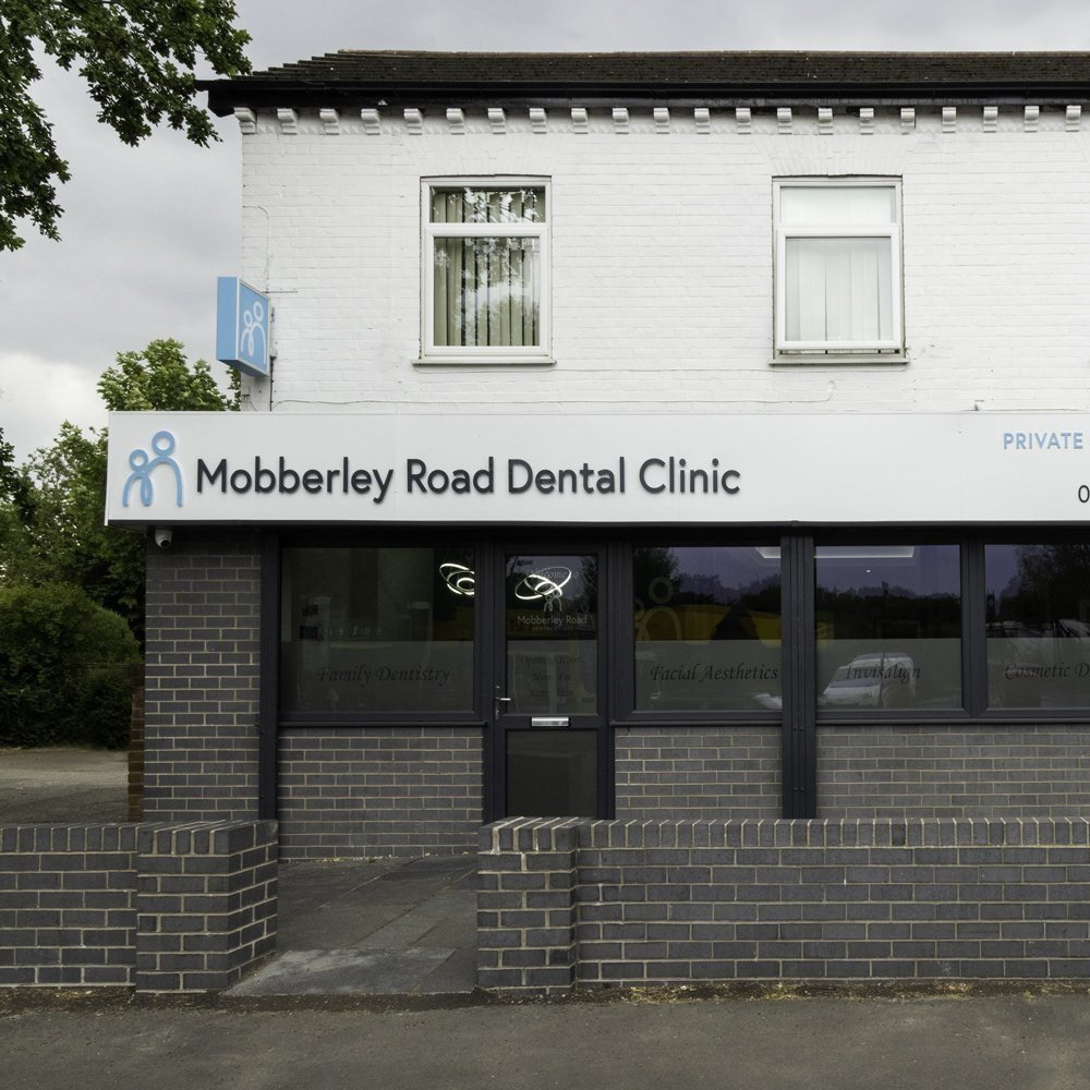


Branding Marketing Materials Website design Apparel Operating as an NHS dental practice since 2013, Mobberley Road Dental Clinic recently undertook an expansion to include cosmetic dentistry and aesthetic treatments. I was approached to create a brand that was still welcoming to its local NHS clients but would also be appealing to those seeking private treatments. It was important to the client that the logo didn’t alienate its current clientele of mainly families, but would attract new patients who weren’t just seeking dental care. I was originally asked to incorporate a family in the shape of a tooth into the logo but upon researching dental clinics I found that this approach had been done many times before which risked the brand becoming generic and forgettable. It would also be a confusing message to those seeking aesthetic treatments and could need rebranding if the clinic were to expand in the future. Therefore I took a different approach, creating a simple logo mark that represented the family and also the dentist and patient relationship. It also represents the M for Mobberley Road and can be interpreted as two teeth sitting next to one another. These multiple layers of meaning meant that clients can interpret the logo dependent on the service they were seeking and provides futureproofing for the business. I paired this simple logo mark with a clean but friendly font, and created a bright but simplified colour palette which elevates the brand to a premium level. Upon completing the branding I was then approached to create a website for the dental practice. This also needed to be clean and concise, introducing the practice in a friendly way but ensuring the breadth of the services offered were clear and easily found.