
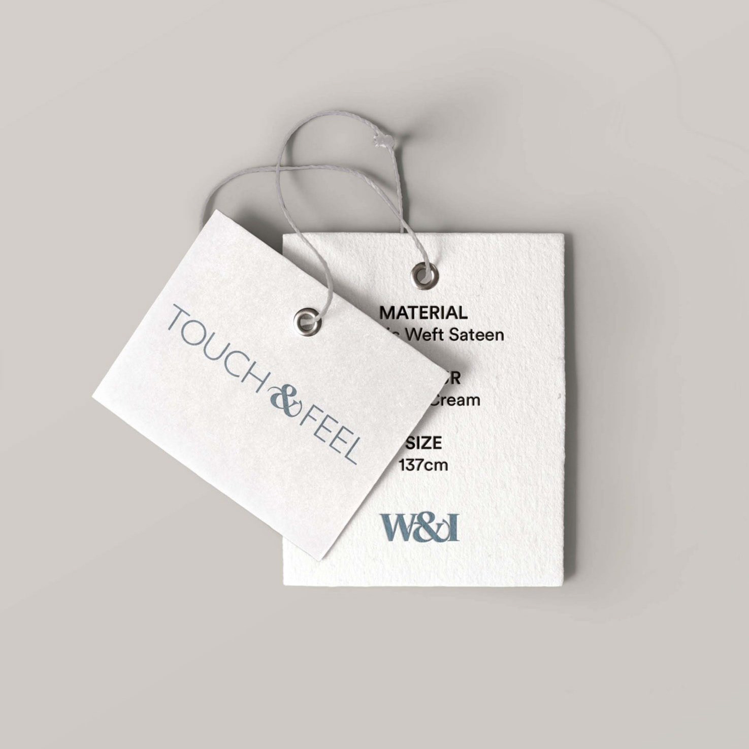

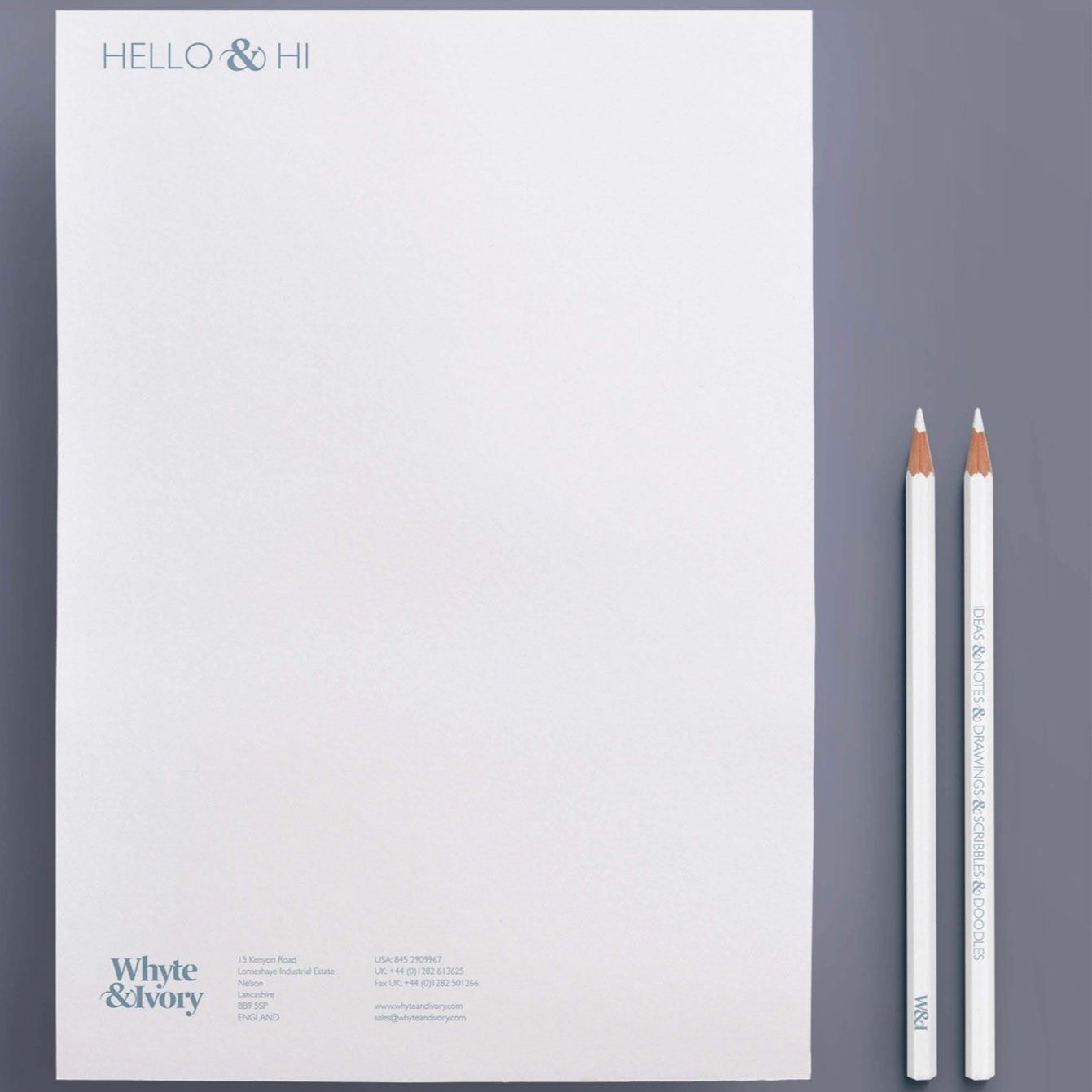
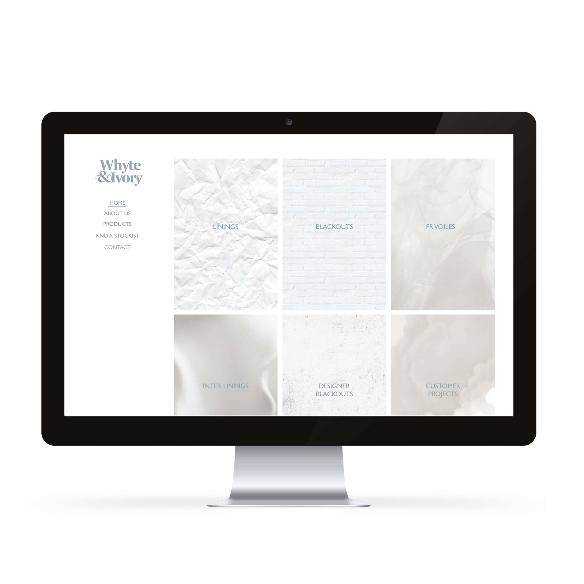
Branding Marketing Materials Website design Pitch for a curtain company based in the UK who were looking to expand to a US market. Making the ampersand the focus of the logo, it has the ability to be pulled out and used as a graphic element across collateral. Playing on the company being in the UK and looking to enter the US market, a copy style was created giving comparisons to English and American culture, using the ampersand to link it back to the brand. A serif font was chosen for the logo to show elegance and style, with areas overlapping and parts of the type being cut out to represent light being blocked out. A muted and dreamy colour palette was chosen to give feelings of calm and rest. The website concept was developed to show how imagery could work to represent the products. As there wasn't photography available, instead we chose to use objects to represent how the curtains and blinds interact with light.